I gave this talk to the Creative Photography Society in 2018 about monochrome photography and why to consider monochrome photography. There are times to use it, times to not use it, and times when its somewhat of a coin toss. The spoiler here is that it all comes down to art, and that will be a big part of this conversation.
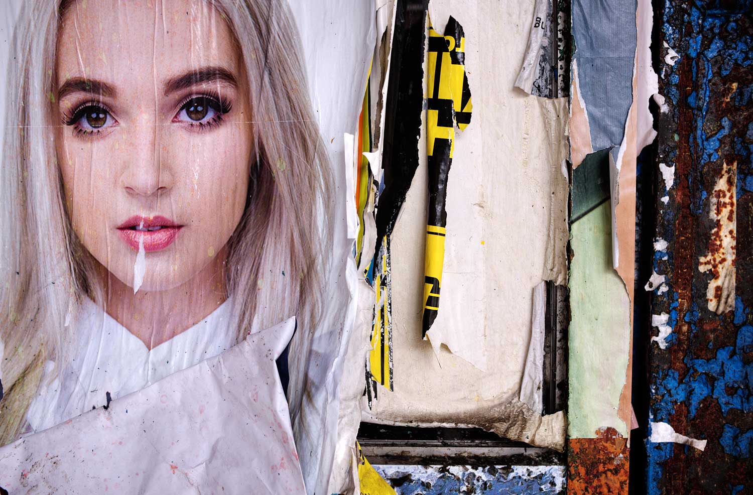
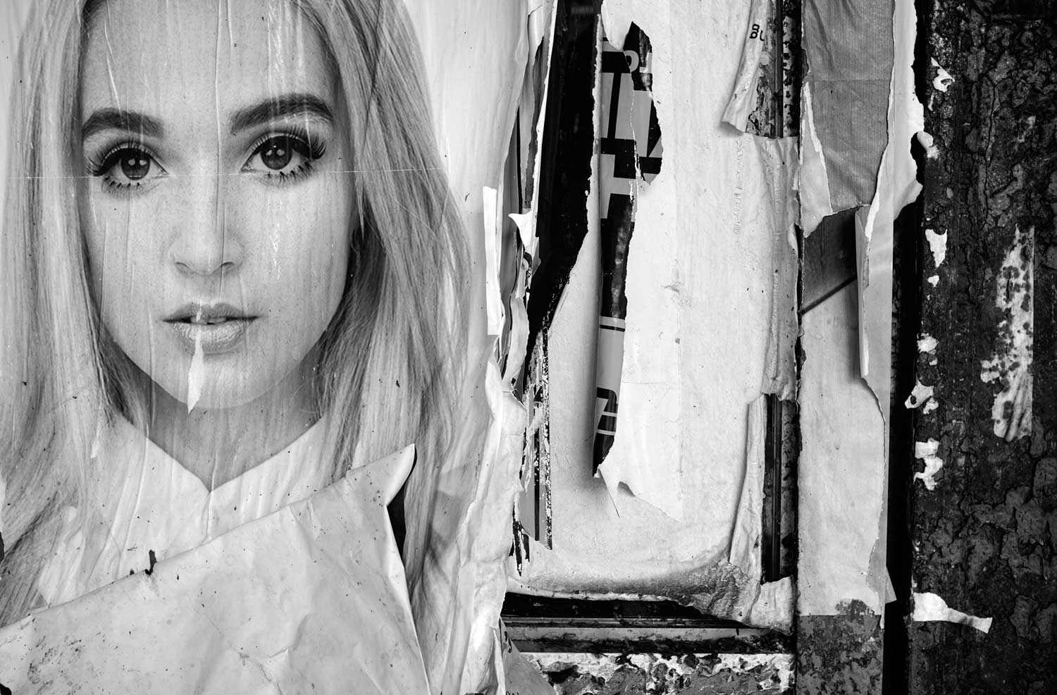
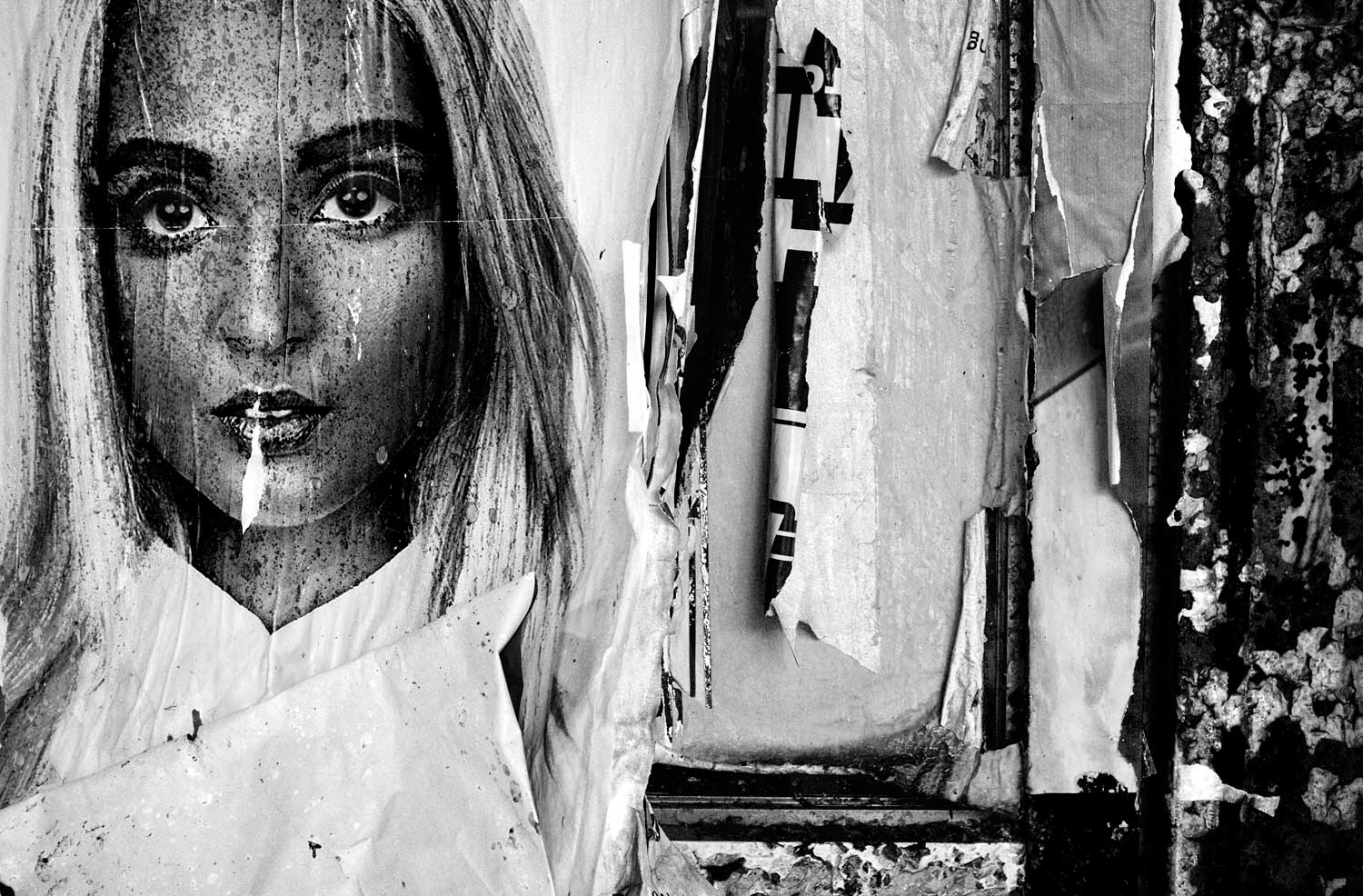
Ill offer the definition that monochrome is where an image is differentiated from the base through the use of a single color. So we could be talking about a red image on green paper.
The question "why monochrome?" is answered simply with "Its easier and harder."
Just to be clear, the opinions expressed here reflect my own personal biases and you may completely disagree, which could be more than just a possibility. After all, if we were the same then there would be little need for photography as art. Think about it there would be no personal interpretation, so the puppies in a basket would be as far as we would need to go. Disagreeing is completely fine. At the very least, you will have thought about what I have said and evaluated it, and whatever engages the thought process is a benefit.
I speak, by the way, in terms of conversion from color to black and white as opposed to photographing only in black and white. For a while I pined for Leicas black and white camera, which I see one can now grab for around $7,500. But I would never spend that much on a camera, partially because I cannot afford it, but also because my Fujifilm X100S might actually offer better results.
This has nothing to do with the camera itself, but with the Black and White adjustment layer in Photoshop. I do not have experience with Lightroom but I think that it also has this capability. This adjustment layer allows me to alter the luminosity of the reds, yellows, greens, cyans, blues and magentas individually in the process of converting to a black and white photograph. I cannot tell you how many times I have used this to give me the contrast I needed to pull essential detail from an image. After all, if the luminosity of the reds and greens are close to one another in an area, then without this ability I might not be able to render that area meaningfully. It could all be mush. So yes, always photograph in color, then make the decision whether or not to convert.
By definition, the difference between monochrome and color is that the latter contains more than a single color as contrasted against the base to form the image. If we turn things around and ask "Why color?" then that might help lead us toward resolving the original question at hand.
Just as an aside, when you take a picture with your digital camera you are not actually capturing the colors themselves. A typical sensor has a color filter array that includes a set of filters over each pixel sensor, one red, one blue, and two green per square. Light passes through each filter and the intensity of the red, green, and blue components is what is recorded by the sensor.
That RAW data drawn directly from the sensor is a measurement of three colors, that when combined, should represent the actual color seen at that point. This is also the case with film, just done a bit differently, but the same idea.
The color we work with is actually tri-tone. What you are capturing and working with through Photoshop or Lightroom consists of three sets of monochrome images, that when combined give the illusion of color.
Color is not actually far from monochrome. Color prints are made up of cyan, magenta, yellow and black, as well as possibly other colors my favorite being the strangely named light light black - that allow the combination to more closely resemble what we expect.
But color is what we see, what we have seen our entire lives. Color helps define things as what they are, a red shirt as opposed to a blue one. When we photograph in color we seeking to replicate the thing that we have photographed.
When we go somewhere and want others to see that place, color is the logical option. When we meet with friends and want to share that moment, then color is the obvious choice. If we are selling something on eBay and want to let the potential buyer see what they may be getting then color is the route to take.
There are many good reasons to use color, which is why the overwhelming majority of people using their cameras today have the intended result of their image to be in color its the default choice. This means that if one is going to take the easiest path, which would be to do nothing with their capture, then color would be the result. Depending upon the reason for the photograph in the first place, this may make the most sense.
Click for larger image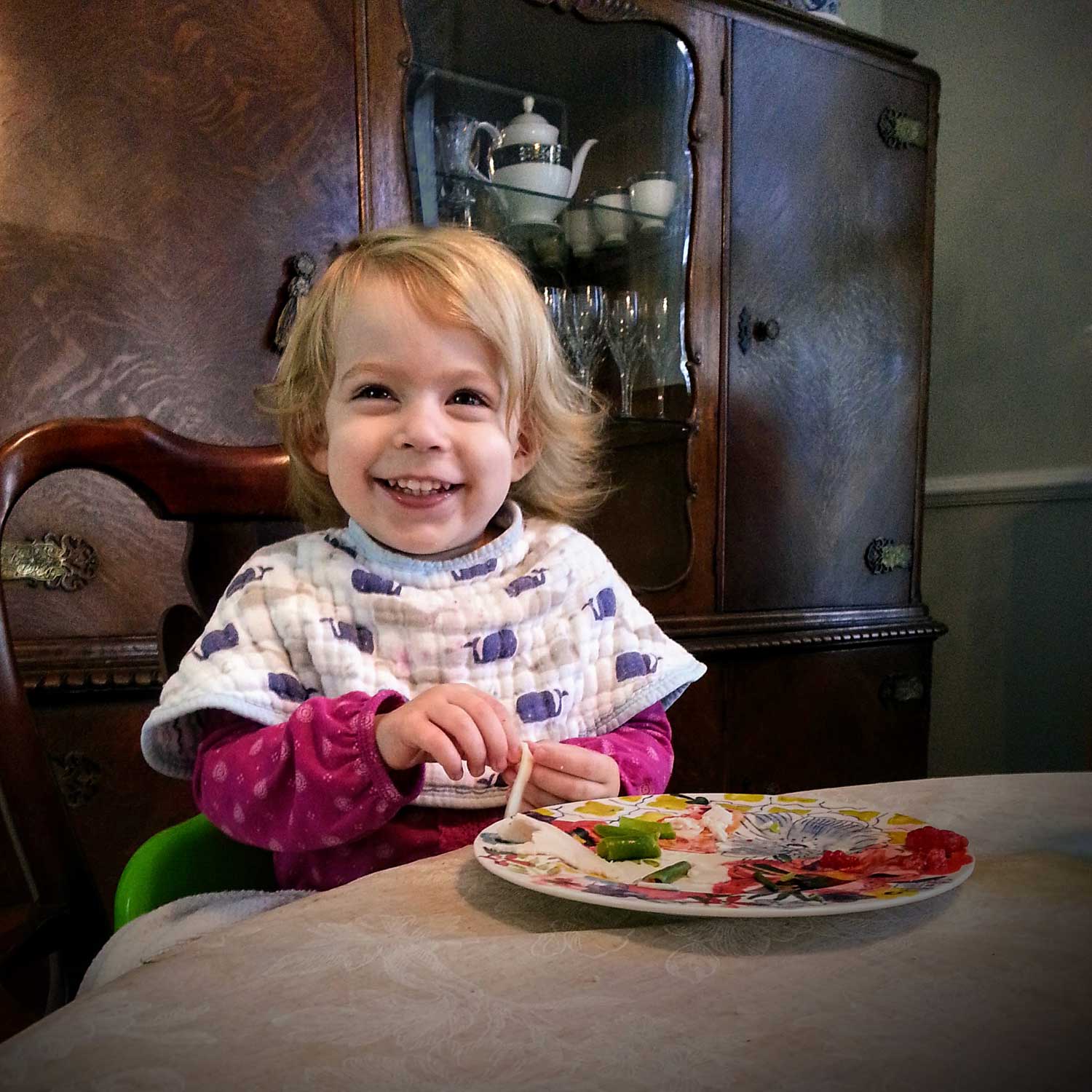 When I take pictures of my granddaughter I do some light editing, but the idea here is to remember a moment, not create art.
In fact, we may wish to intentionally not create art and Ill talk about art in a little while, as well as the definition I have for art dont hold your breath, the definition will be disappointing.
But it is important to think about why we may not wish to create art. Take a look at the image on the screen. If I ask my granddaughter, who who was two years old at the time I created this picture, to smile I get a show of teeth funny but that is not her. However, if I make an exclamation, like "Mercy Buckets!" or "Okey Dokey Lia Pokey" she thinks thats funny and gives a great smile. That is her, and I want to have that image as the moment presented itself not an interpretation of that moment.
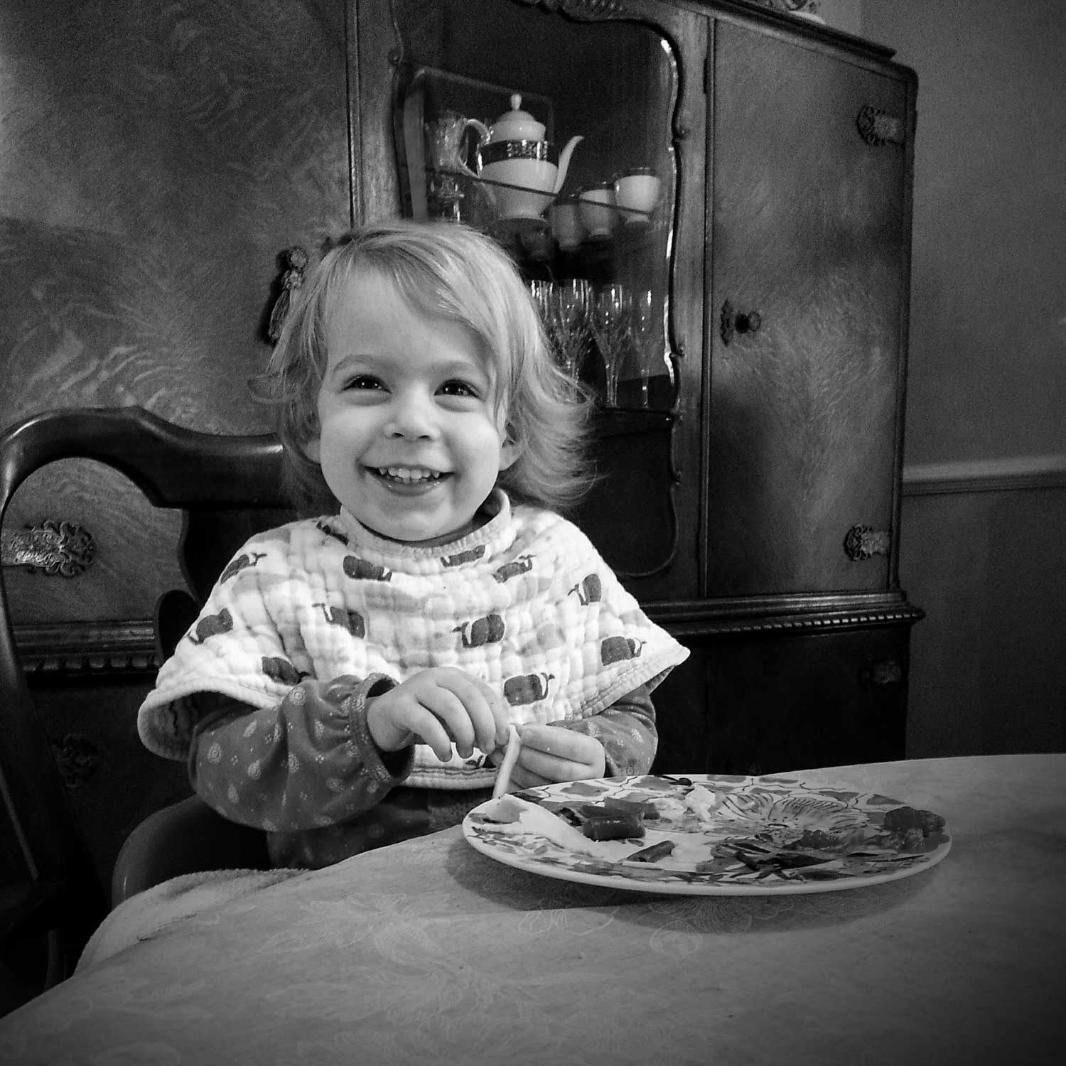 If this image was in monochrome then much gets lost. I am now looking at a partial abstraction of the moment, and this would be a moment that I did not experience, so already I am partially removed from it. Thats the last thing I want.
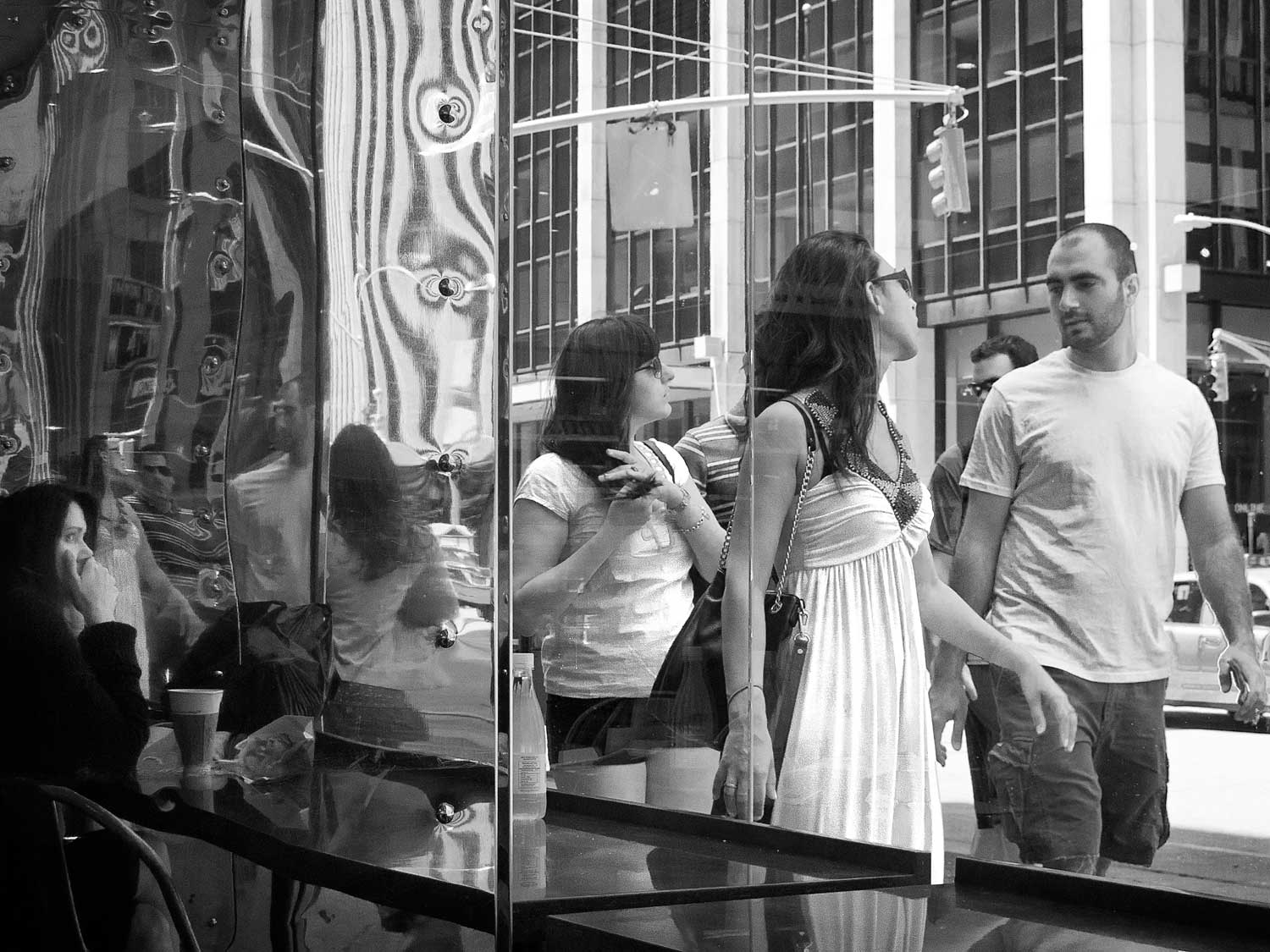
Another excellent reason for using color comes when the color itself offers essential information. I photograph a lot on the street and the result is almost always in monochrome, but sometimes the color needs to be there.
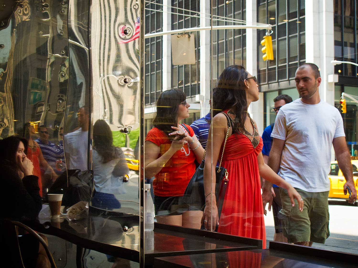 In this image there are two important elements. The first of the two is the two women walking past the window wearing red dresses. Without the color in those dresses the image falls apart and becomes uninteresting to me. The other important element is the woman all the way on the left looking out the window. At first you may not notice her, but note that other than the flag at the top and the dot of the stop light, the only other red you see is on the left, outlining this woman. In this situation the color plays a major role in providing important information within the image. Lets see what it looks like without the color.
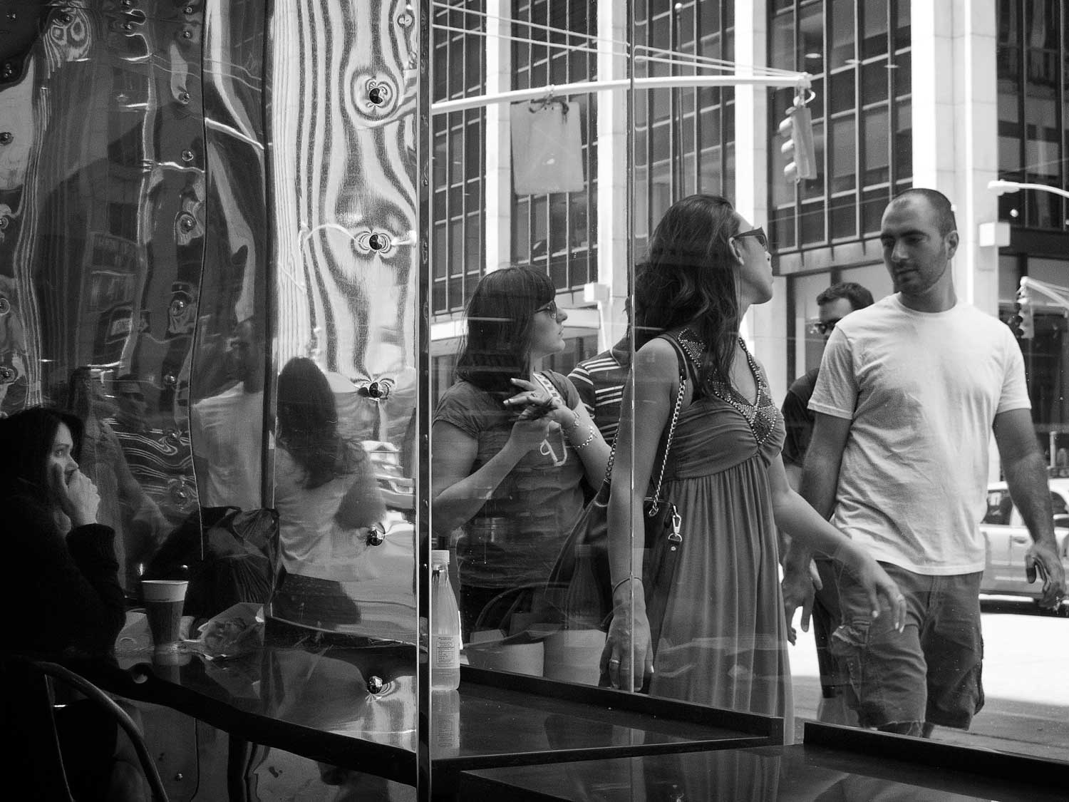 In my mind, even if I worked on this image as presented here, it still would completely lack the emotional impact of the color version.
It sounds to me like I am making some good reasons for using color, and indeed, if I were to try to suggest that everything be monochrome then following that advice would cause one to lose some opportunities that offer themselves.
This is one of the reasons I have almost stopped using film and am photographing digitally. The image you see before you has simply been desaturated, so its somewhat close to how things would have resulted if I had been using black and white film.
 However, with a simple Black and White layer in Photoshop, I have six sliders that allow me to alter luminosity specific to certain colors. This still is not as interesting as the color interesting image, but is a heap sight better than the desaturated version.
I can go on about other reasons to use color, but I just wanted to make the point that color can be a valid option.
Unless you are taking a picture of a white cat in a coal mine, the monochrome image will be an abstraction of what was photographed. What you are offering can no longer be considered to be a true representation of the scene. You have taken the first step in changing that what was to that which you are presenting. You have begun the process of interpretation.
And now we get to talk about art, which is, for me, the primary reason for utilizing monochrome. Don’t get me wrong, monochrome does not define art and there are many color photographs that certainly are art, but monochrome can oftentimes be used as a guide.
Before getting into any of that we need to first define the word art.
Even when I was young I thought about how to define the term music. Over the years my definition morphed all over the place until in college I read about John Cages piece 433". Initially it made as little sense to me as it will to you when I explain that the performer in the premier of the piece it was a pianist does nothing for four minutes and thirty-three seconds, then leaves the stage. Thats it! Youre thinking, "Thats not music!" and indeed there are no notes involved. However, John Cage was a composer of aleatory music, or music by chance, so in this case one would be listening to the ambience of the room which certainly would have included the whispers of people asking one another what the heck was going on.
I could not find the source, but I believe that I remember reading John Cage say that music was that which is perceived as music. Indeed, this is a circular definition, and an unsatisfying one at that, but I think it is spot on. I remember cranking up Hendrix when I was in high school and my mother telling me that that wasnt music. She was right! I argued that it certainly was music. I was right!
Music is not like a table or tree, its definition changes to fit the individual. My definition of art is pretty much the same art is that which is perceived as art. Thats not satisfying, but its a start, and it helps get me where I need to go in this talk.
The term “art” has been the bugaboo for photographers throughout its life to the point where its application to photography is still sometimes questioned, and I would say that some of these questions are legitimate.
If I take you to a vista and point to it, have I created art? We can all agree that the answer would be no. If I were to take a picture of this vista and give you the print would it then be considered to be art? I would contend that the answer would still be no. What if I did something to the image that changed it so that you did not see what I had pointed to, but was my interpretation of what we had both seen?
I suggest that this is the departure point, where we have taken something that would have been a two dimensional representation of what was seen, and offered an interpretation of that representation. How I choose to interpret that vista should hopefully help translate the emotional impact that vista had on me.
This interpretation can be done in numerous ways. For instance, Modest Mussorgsky viewed paintings in an exhibition and wrote a piece of music to match the emotional impact these paintings had on him. Had he just taken pictures of the paintings we would not have cared.
So returning to the definition of art being art is that which is perceived as art, there are two parties involved, the artist and the viewer. The artist creates the art and the viewer accepts what is presented as art or does not. Monochrome can assist the artist in creating the art, and it can also guide the viewer see the photograph as art. These are two separate issues so I will address them separately.
As mentioned, as soon as you convert a color image to monochrome you have left the realm of reality the idea that what you are presenting is not intended to be a replication of reality. The conversion of color to black and white is a step toward abstraction. Like a story told numerous times, you now have the ability and I would say, the duty to offer your own interpretation. This is the pin upon which everything else revolves. The way you offer the interpretation says everything about you - your thoughts, your beliefs, your mindset - everything.
The part of "Why Monochrome" where I mentioned that its easier refers to the fact that with reality out of the way, there are numerous tools that can be used to assist with your interpretation. When we work with color, any changes to the color that are noticeable to the viewer can distract from the image, especially if the color is of a recognizable thing. With monochrome we are dealing strictly with luminosity, the relative quantity of light that defines each part of the image.
The simple tools of burning and dodging can bring out highlights, hide distracting elements, create paths, and hold the viewers eyes within the frame. Yes, these things can be done in a color photograph, but in a color image when you change the luminosity you change the color, and again, perhaps distract the viewer.
And speaking of color, since we really are talking about monochrome, as opposed specifically to black and white, consider that one can select the color of the monochrome image without having to deal with colors relating to the reality of the scene.
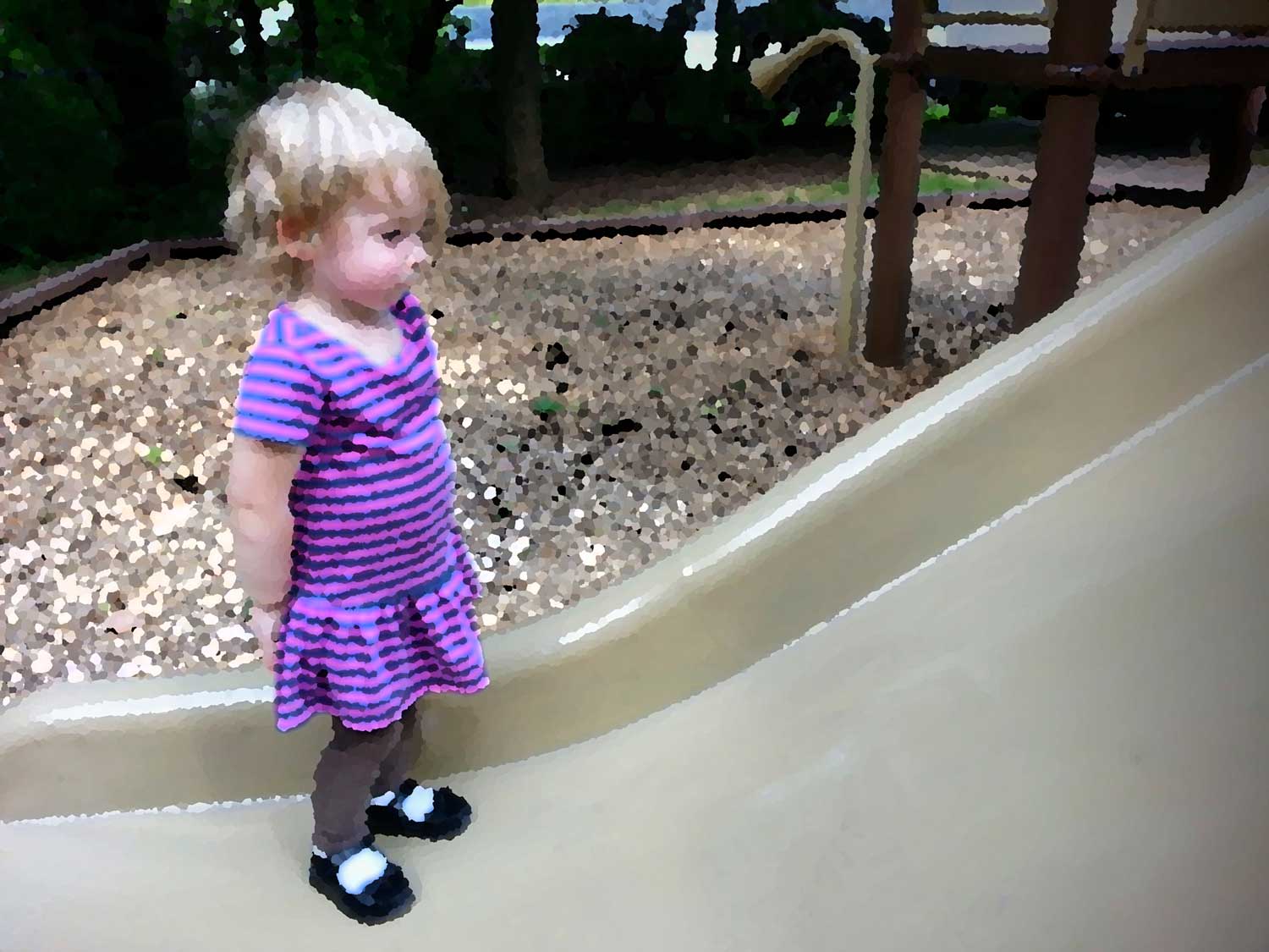
 As an example, Ill add another picture of my granddaughter. Sure, this might just be an excuse to show pictures of her to an unwilling audience, but this will actually be instructive. I decided to use a brown tone here because it worked with my interpretation.
Ill explain why this color and why this photograph, which started as a snapshot, to me, is art. Perhaps you will agree, perhaps not.
We associate the brown color with images we have seen from older processes Vandyke, platinum, albumen, etc. There is a feeling of nostalgia, a sense of something as having happened in the past with the brown color. I wanted that feeling here.
As I mentioned, monochrome, as opposed to simple black and white, gives us the ability to use the abstraction of our original image in a number of different ways. We might consider using red as one of the two colors in the image to give it a particular feeling. Long ago I used red paper and made a print of a farmer working his field. As the sky, as well as the other background tonalities, was red, it gave one the feeling of a farmer working at the end of the day.
Other colors are certainly possible. If you think of a cyanotype then you are thinking of an image that is probably blue and white. This is not normally my choice, but there are many great images that have employed this technique, most notably a friend of mine who used cyanotype to dye a sheet, after which she laid on it in the sun to expose the sensitizer very cool (though perhaps not literally). Ive got green toner at home but have never found a use for it.
Also keep in mind that we can do a bit of cheating with monochrome by slightly stepping over the line. Split toning an image changes the silver to more than one color, but we still think of it as monochrome, though technically it is not. In my mind, that hint of color can sometimes help invoke a feeling that might not readily be identified, and sometimes that subtlety can be quite effective.
For me, this is not an image that tells me of something she was doing, like talking to her bunny or playing with her small animal toys. This is a picture of how she was at a particular time in her life. Other snapshots I have of her will remind me of her building an igloo with her blocks or enjoying slowly crunching her graham crackers a millimeter at a time. This is an impression of who she was at age two, and in this image, I am wondering what she is thinking.
What she is actually thinking and what I think she is thinking are almost certainly two completely different things. She tends to zone out and focus on something unknown to me at times and while I might want to believe that she is contemplating the universe and her eventual role in it, she is actually more probably trying to remember if her white bear is in the living room or upstairs in her crib.
But thats pretty much the point. When we are working with a color image we are looking at what is, whereas when we deal with monochrome we are seeking to offer an interpretation, and the difference between actuality and interpretation is the difference between snapshot and art.
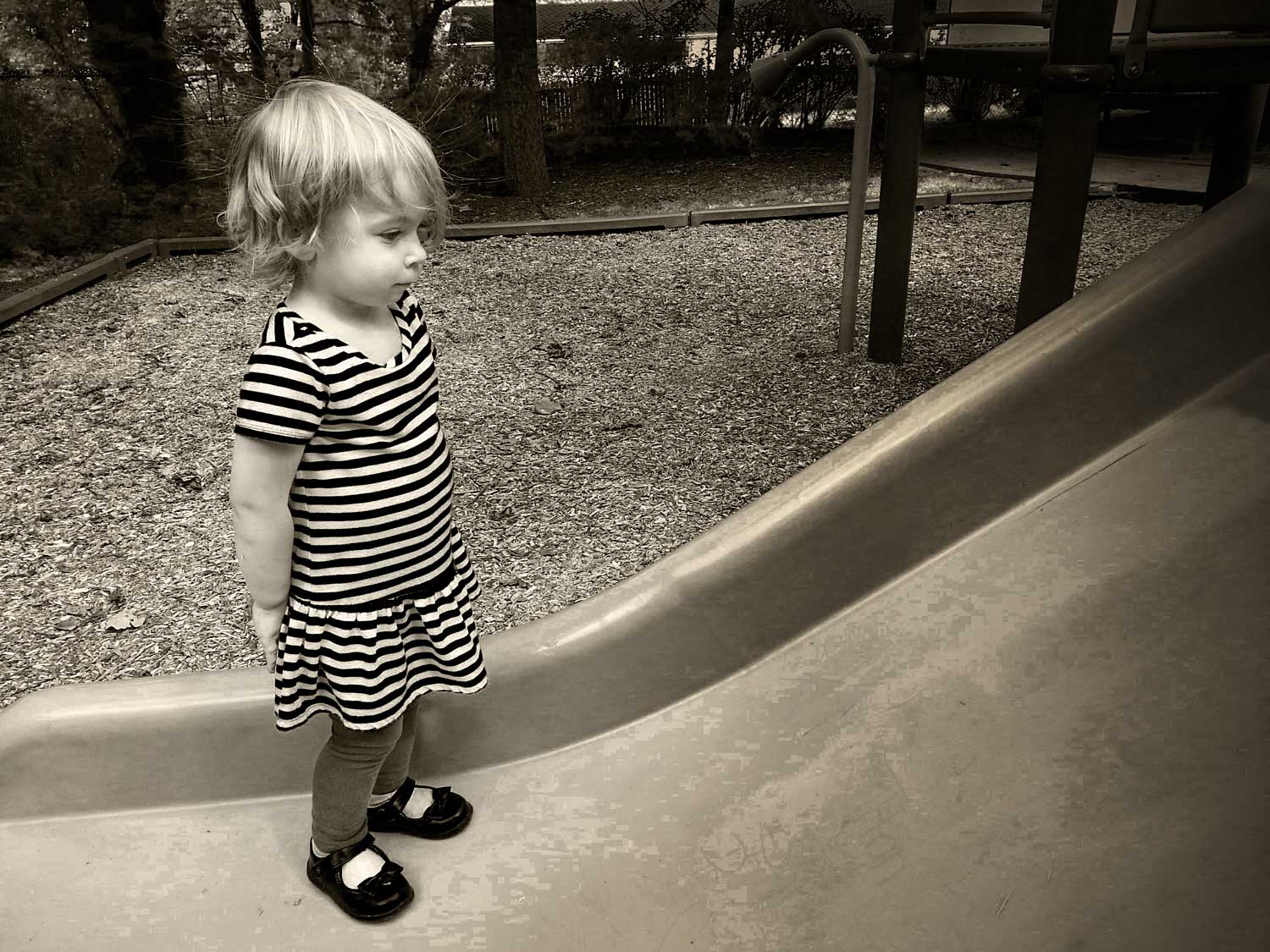
In this image she is standing at the bottom of a slide, looking up. The actuality is that she had gone down the slide and instead of going around it to get to the ladder to again reach the top, she was trying to determine whether or not she would be able crawl up the slide to get there. That is not my interpretation, which would be boring.
She is two years old and as I look at the image I see someone wanting to look into the future to see where her life will take her. We all have difficulties in our future and perhaps as a woman to be, her difficulties will be compounded by that fact. Its amazing that that might still be a question.
By the way, the fact that she is looking at the difficulty of climbing this upward slope combined with the fact that her dress has horizontal stripes is just a bonus.
 Converting from color to monochrome moves me from reality to interpretation, it has allowed me to separate object from idea. To further illustrate lets take a look at the original. Here you see the snapshot as I processed it in Google Photos. The only difference between this and the original is that I added a little contrast and some vignette. For what its worth, Google Photos doesnt offer much, but its great for snapshots of this sort, where you dont want to spend more than about 30 seconds working on it.
Its not a bad image at all, but for the interpretation for me the color gets in the way. There is a house in the background, and while that would normally not be an issue, this one has a blue roof, so being the only blue thing in the image, it is noticeable. Anything in your image that is noticeable that does not contribute to the meaning ends up working against it.
Also, in the upper right there is a tube that bends in her direction. This is one of those things where one can talk into one end, and at the other end of this playground beast someone else can hear through the tube. If the tube continued straight up and the horn was not visible then it would not be an issue, but this distracting item takes away from an otherwise relatively clean image.
With the conversion to monochrome I was able move the blue slider down to darken the roof and make it less noticeable. I created another black and white layer above this to tone it. I also selected and darkened the upper part of the tube with the cone to get it to blend in a little better with the background. I darkened the side of the slide on her left to emphasize the curvature of its upward motion and did some general dodging and burning, as well as a vignette.
If I had intended on this being the final version of the image then I would have dealt with the highlights in the house in the background and may have even cloned out the horn, but my intention all along had been to make a Bromoil of this image.
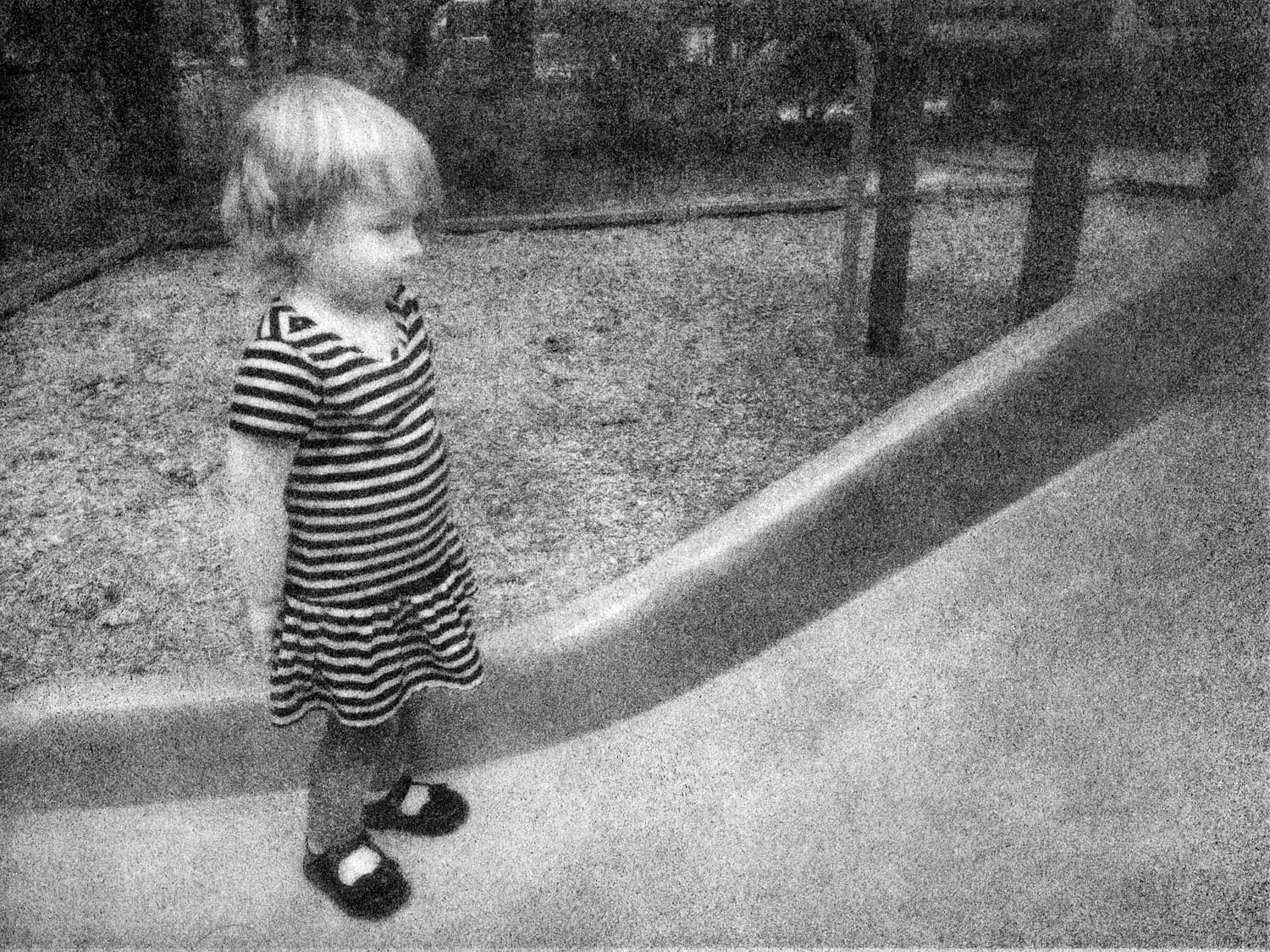 Bromoil is an early 20th century photographic process where one removes the silver from a traditionally made photograph and replaces it with lithographic ink by repeatedly striking the surface with an ink-charged brush. I knew that this process would basically remove those distractions so I made a digital negative, created a print, and worked it with the Bromoil process. You will notice that this image is not brown. Bromoil is a time-consuming, labor-intensive process, so I usually make a small print and if I like it then I spend the time to make a larger print. This one was done on 8x10" paper and perhaps I will make this in a larger size and add some yellow to the ink to make it brown.
This process gives the print a very grainy effect and removes fine detail. My idea was to make this image more ethereal, which adds to the mystery of the image, as well as suggesting that there are things that need to be filled in for one to completely understand it.
The final version is quite removed from reality. It is no longer a snapshot of a little girl at the bottom of the slide, but is now the representation of a woman-to-be wondering about the hurdles she must make in the future, which is why I call this image The Road Ahead.
Not only am I able to get my point across better with the conversion of this image from color to monochrome, but also the conversion gives me a chance to let you know that I am not looking at this as a snapshot. Here I am doing something with the image that one might not expect. My guess is that images of your family and friends are in color because you want to remember them and the time when you photographed them, which makes sense. By changing the image to monochrome I am letting you know that I have taken time and effort with the image, and whenever you do that you are saying that there is an attempt to elevate the image from snapshot to art. If nothing else, at least the viewer will almost certainly stop and look at the image for at least a few seconds, which is more than can be said of the same image in color I might look at it, but we are seldom interested in other peoples grandchildren.
Now that you have the explanation, you understand what I have done, why I did it, and what it means to me. If you had seen this final version at the outset then perhaps it would have meant to you what it means to me, but probably not. As I mentioned previously, this is a participatory sort of thing that involves both you and me. I created this as art. I am hoping that you see it as art. If both of those statements are true then we can agree that this is art if one is not then we will simply have a difference of opinion for me it is art, for you it is not. Remember, for me, art is that which is perceived as art, so there is no solid definition here. It is okay for both of us to have the opposite opinion and both be correct.
I guess I should mention that converting a color image to monochrome should not be done in an attempt to create a trick image. By "trick" image I am referring to something that looks or is phony. I am speaking from a photographers viewpoint. From a marketing viewpoint there is advantage to the "puppies-in-a-basket-looking-like-a-painting" aspect of things, but if this were a marketing talk then I definitely would not be the one to give it.
The photographer should not be hoping to trick the viewer into seeing something that is not worthy of the photographer. Converting an image to monochrome without reason, outside of the hope that magically one has created the perception of art, is at best not fulfilling. If you are not fulfilled with your photography then why are you doing it in the first place?
In the beginning I said that I often choose monochrome because it is easier. The fact that I took the time to convert the image to monochrome, printed out a digital negative, and went through the three day process of creating a Bromoil print might make one wonder about that statement, but how do I achieve the same thing working with color?
 Here is what some might do with the color image to make it art because now it "looks like a painting," or perhaps we could go the route of the photographers nightmarish dream of over the top tone mapping of an HDR image
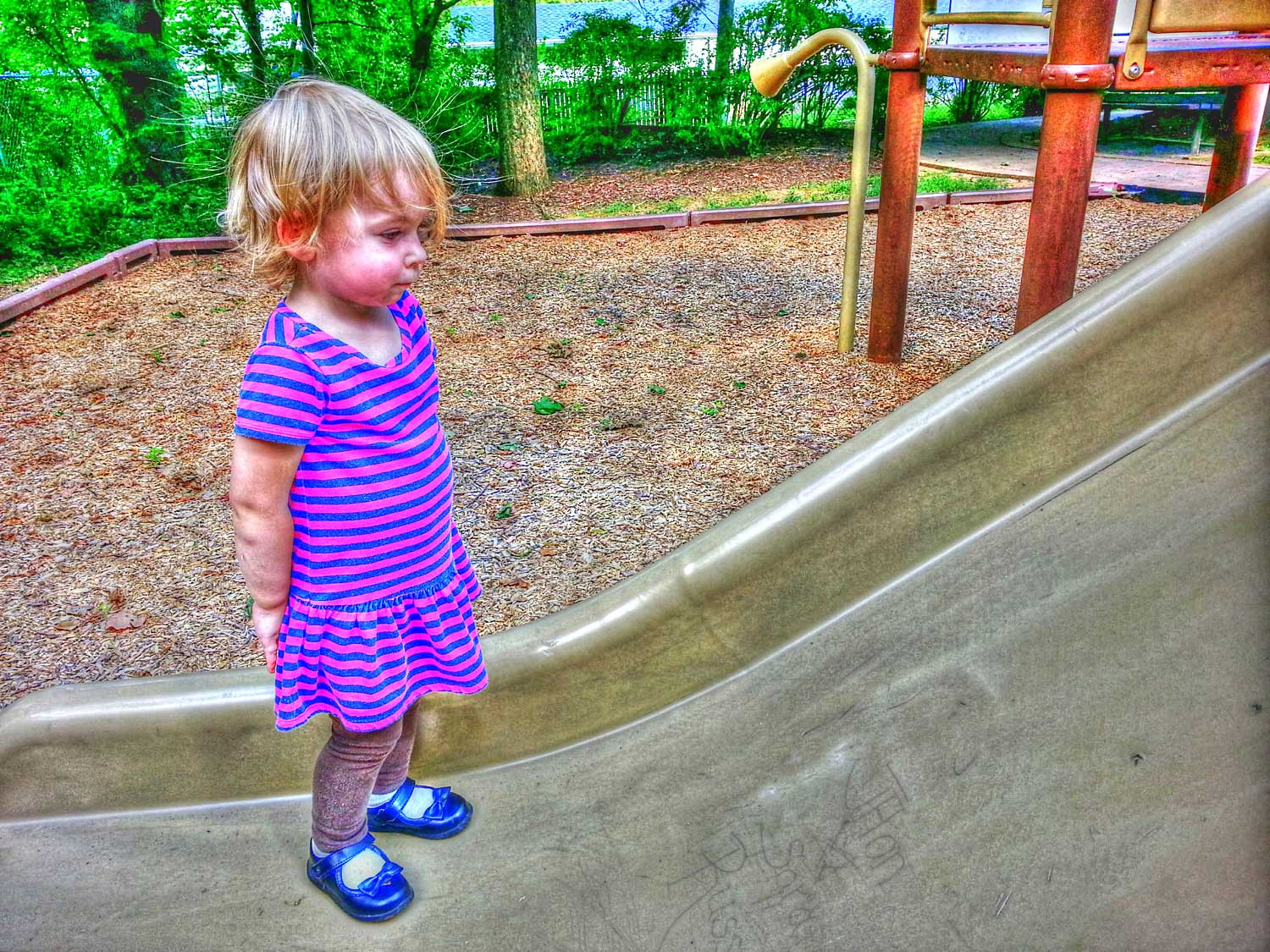 , but I am guessing that nobody here would go to that silliness. In my mind one could easily stop at the simple conversion and think that the feeling might get through.
Lets look at some images and think about whether or not they should be offered in color or monochrome. As in all cases, your mileage may vary and your conclusion can be completely different from mine, but at least thinking about what we are doing is really the important thing.
I was in New York City in November and did quite a bit of walking and photographing, so well take a look at some of those images. The images I am going to show are definitely not completed, but simple conversions with perhaps just a bit of processing. The great thing about working digitally is that one can quickly add a Black and White layer and move some sliders to get an idea as to whether or not converting to monochrome makes sense.

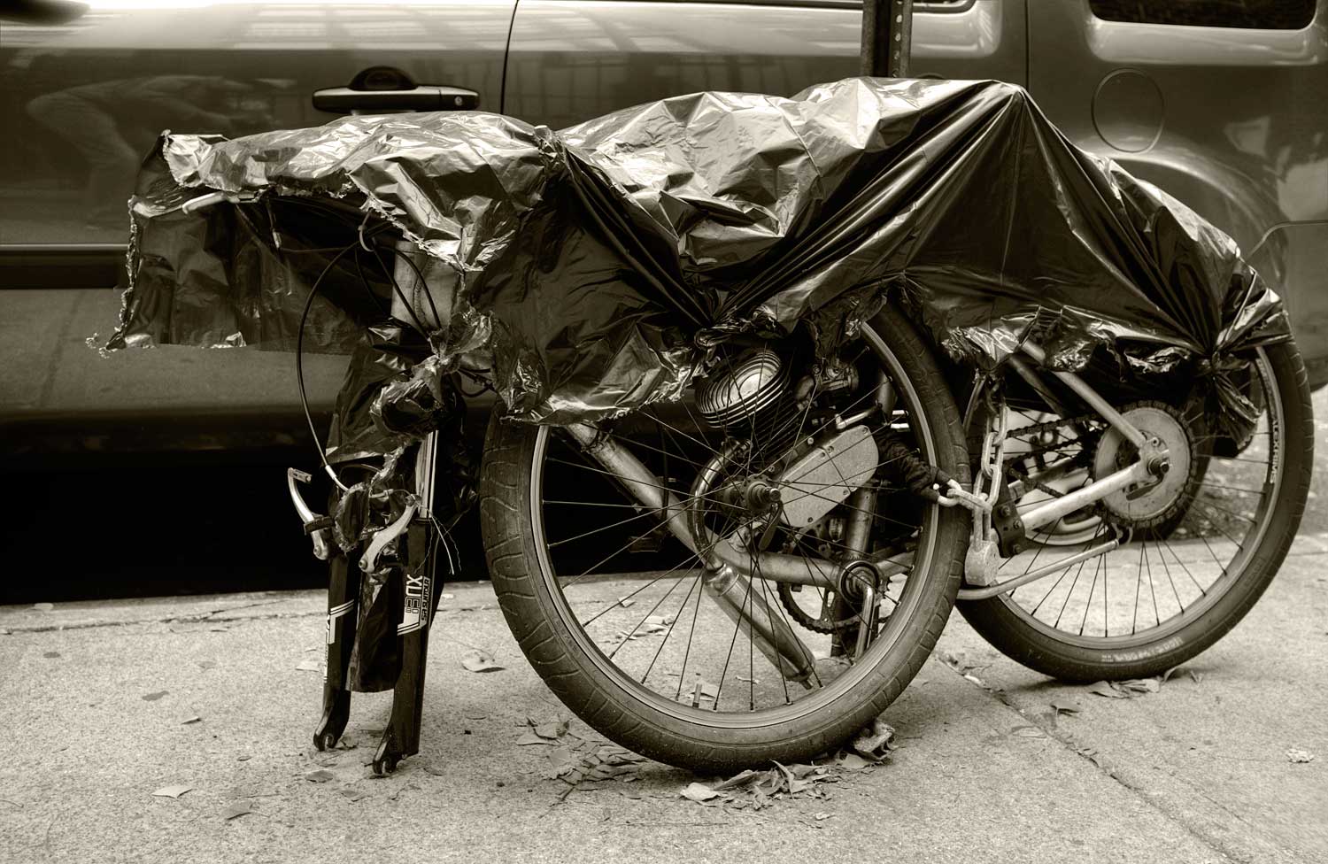 Here is an image of a bike. In my mind this is rather straightforward in the respect that what little color there is in this image offers nothing that conveys information that I feel is necessary. For me the leaves are just there and their absence would not be missed, so converting this to monochrome makes sense. But it is all about what one is trying to say. For me, I saw this as more of an abstract, and you will notice that the conversion actually lost some detail. The detail was not important to me, but if it is to you then perhaps the conversion to monochrome should not happen.
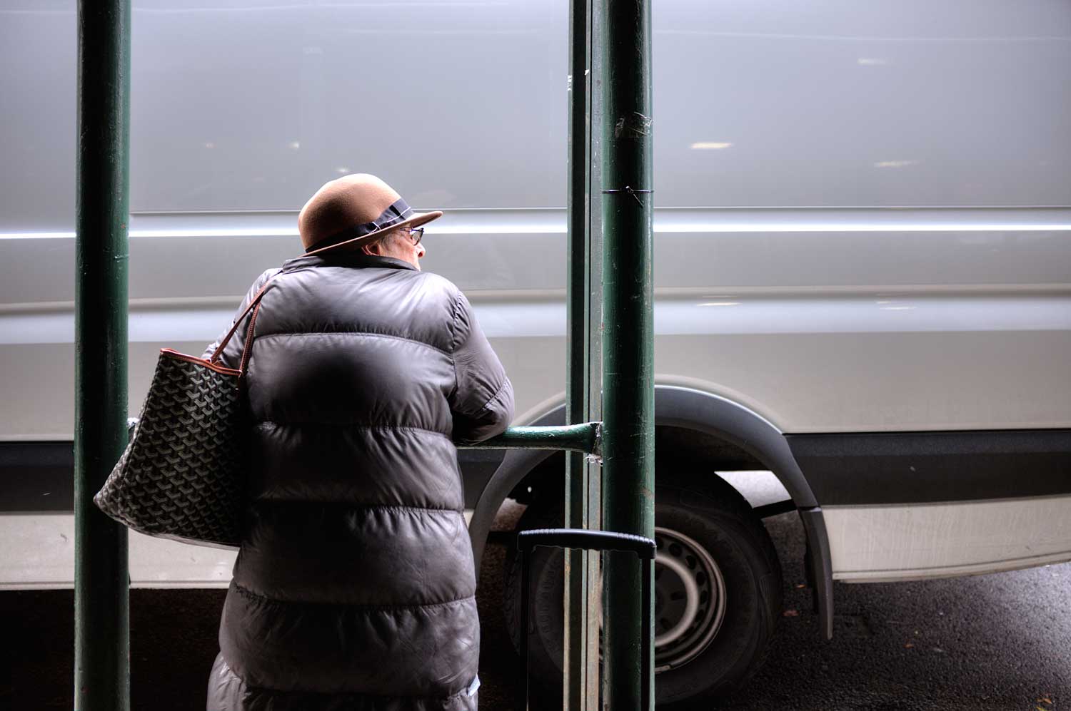
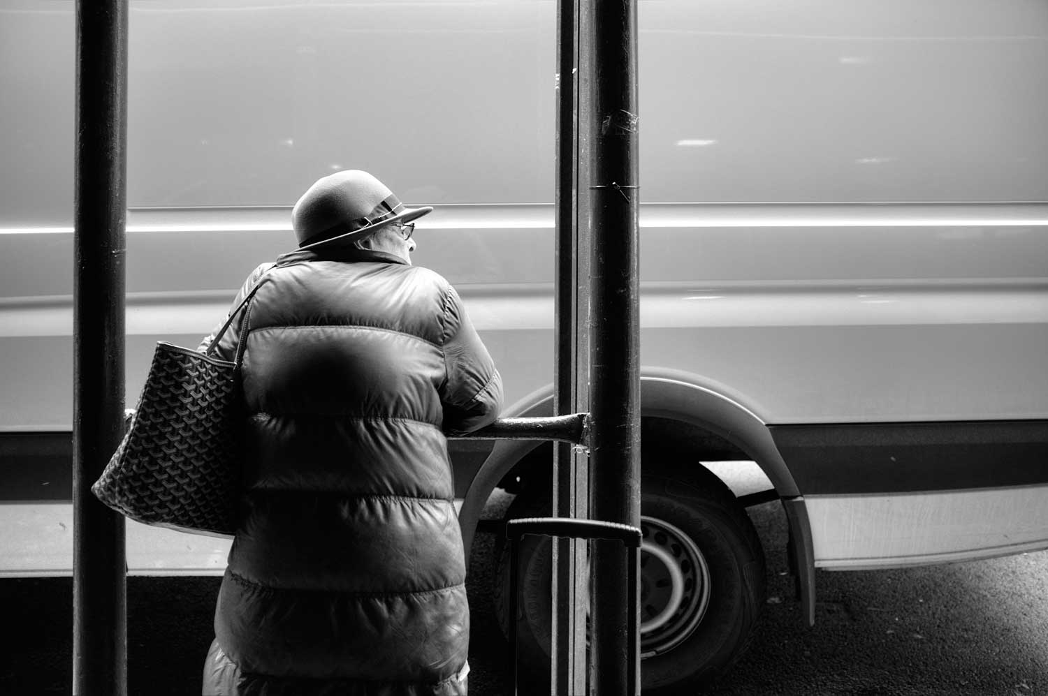 Another one that might be fairly straightforward is called Passing Her By. Here is the simple conversion. For me, losing the color helps keep her as part of the complete scene, as opposed to being an element in the scene. Those two are almost the same, but we have a woman, her bag, a van, and green posts to either side. If the idea is to use these elements together then perhaps keeping things in color might be considered, but I wanted everything to be one, with the idea that the woman was being held back by the elements that surrounded her. This is nitpicky, but most of our decisions are nitpicky and unlikely to be noticed by the viewer.
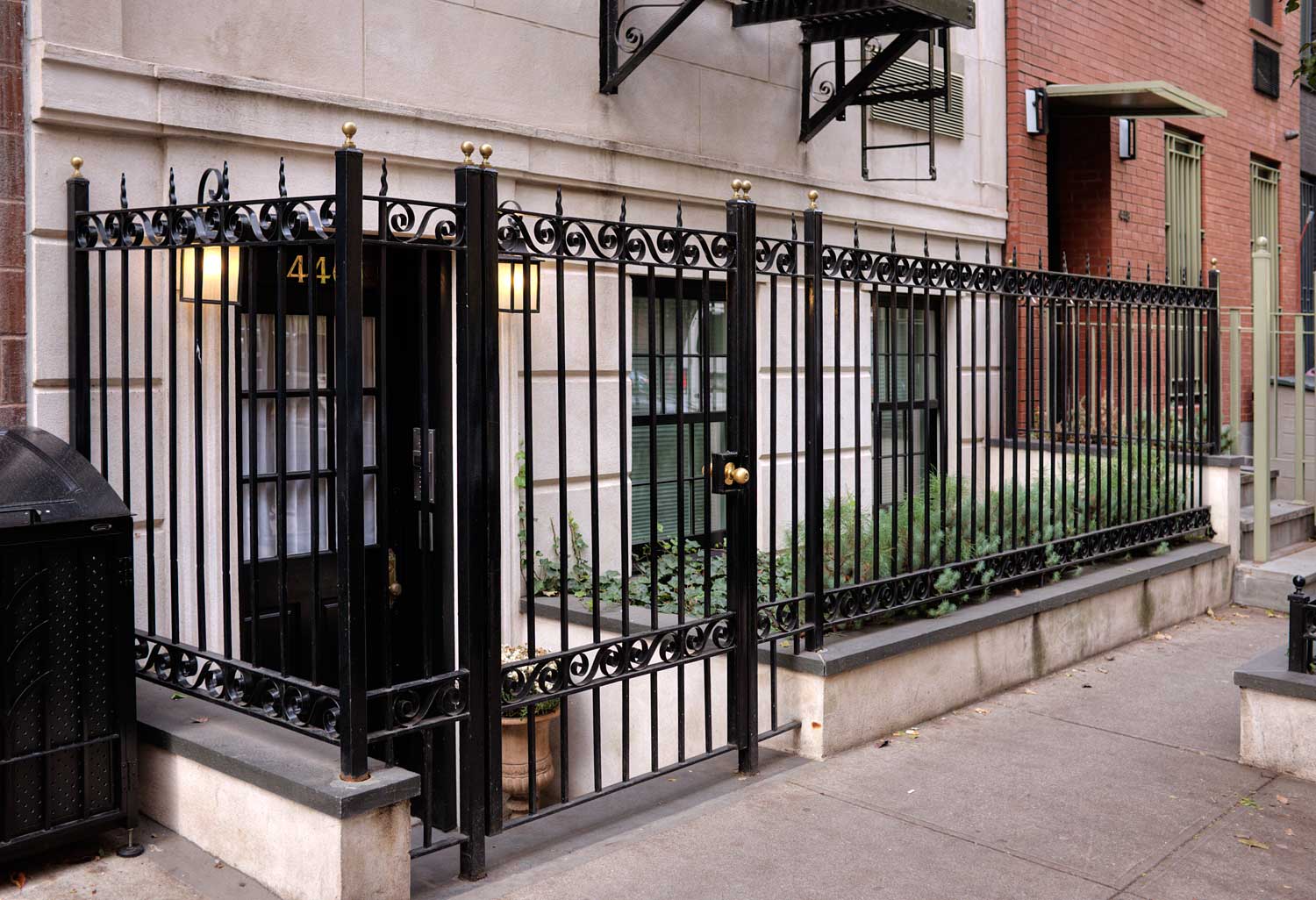
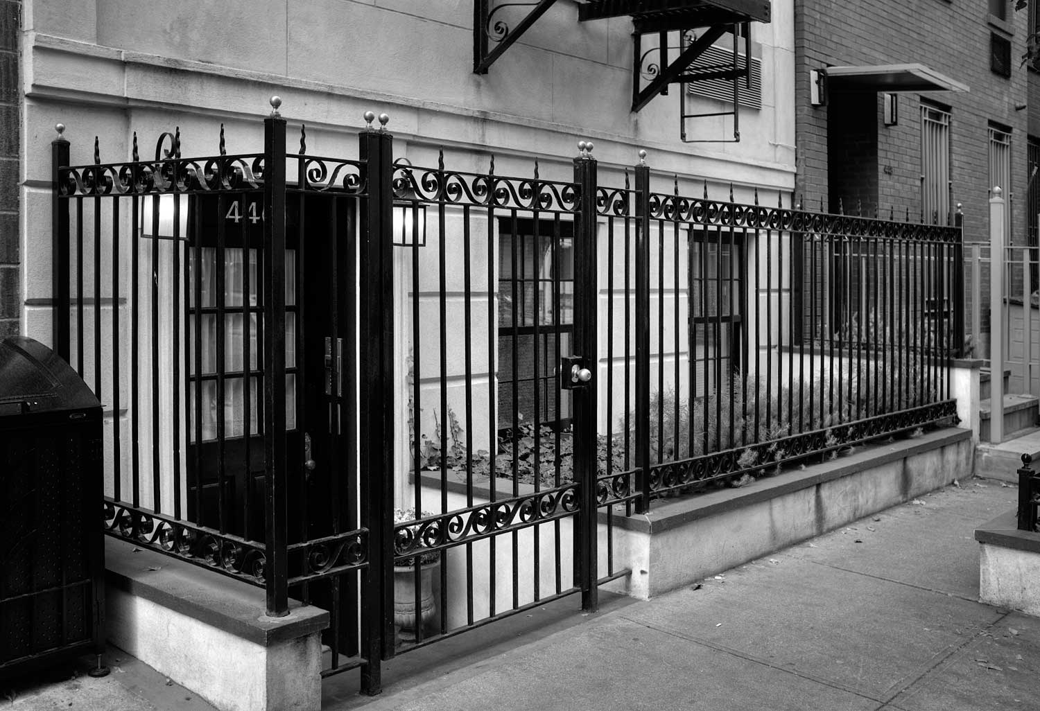 The Prisoner is about a very nice residence in Chelsea there are many just like this that needs to have bars keeping people out, which also keeps the residents in. Although this place certainly costs more than I could afford, I see it as a bit sad and wanted a darker representation. Through conversion to monochrome we can see that the red of the residence to the right becomes dark and the white façade turns gray. A final print of this image would be much darker.
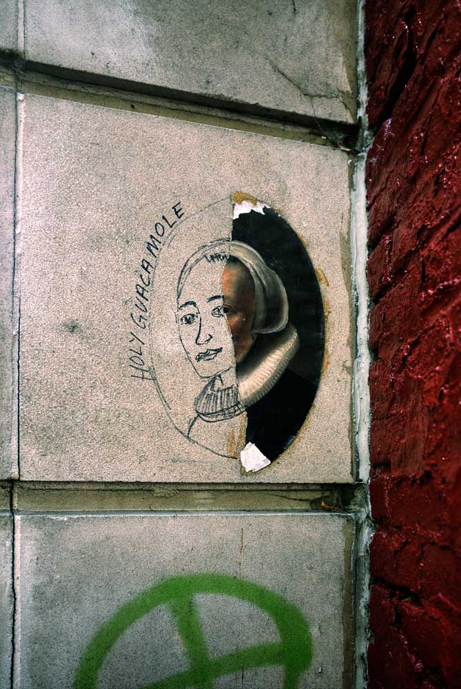
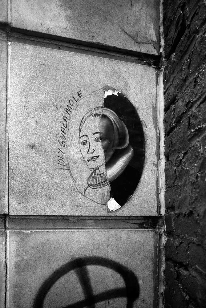 Of course, not all images are serious, that would be too depressing. This one is called Holy Guacamole. Apparently a print from an old painting had been affixed to a small corner of a building and had weathered partially away, so someone completed the image and added "Holy Guacamole" to the side. Here is the monochrome conversion. It loses its impact when we lose the color. The wonderful red of the building on the right, which works as a border, is gone, as is its complementary color of green in the spray painted symbol below. We also lose the bonus that green is the color of guacamole.
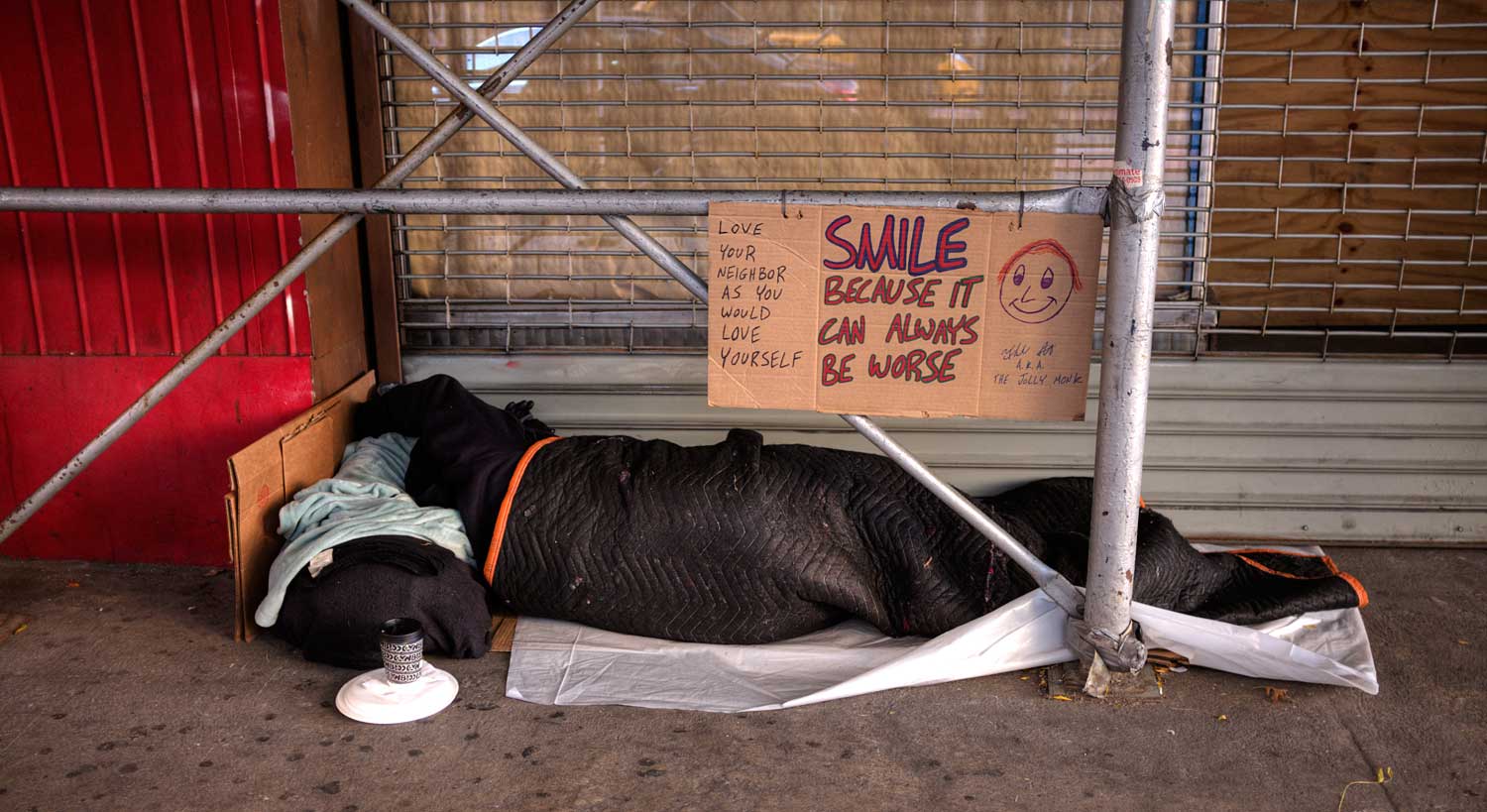
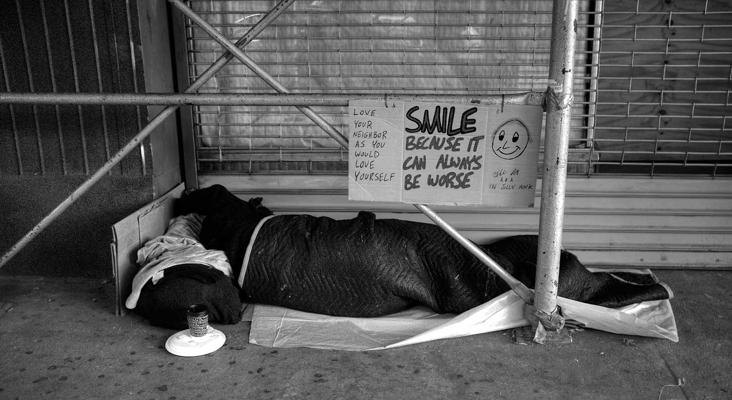 As a rule, I do not photograph the homeless but I felt that this was an exception. Is the color essential here? Lets take a look at it in monochrome. On the one hand, the color version works because the print on the sign is in red, which is also the color of the building on the left. On the other hand, perhaps the color is a distraction to the message. I prefer the monochrome version because pretty much everything but the message is stripped away, but it isnt as if the message is lost in the color version. In my mind this one can go in either direction.
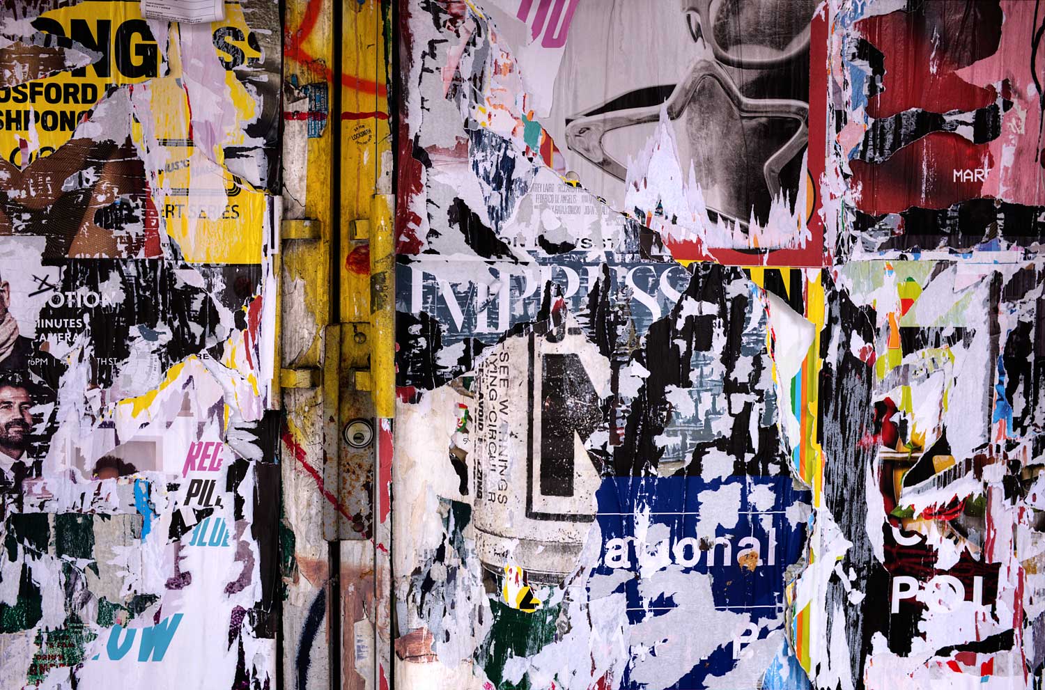
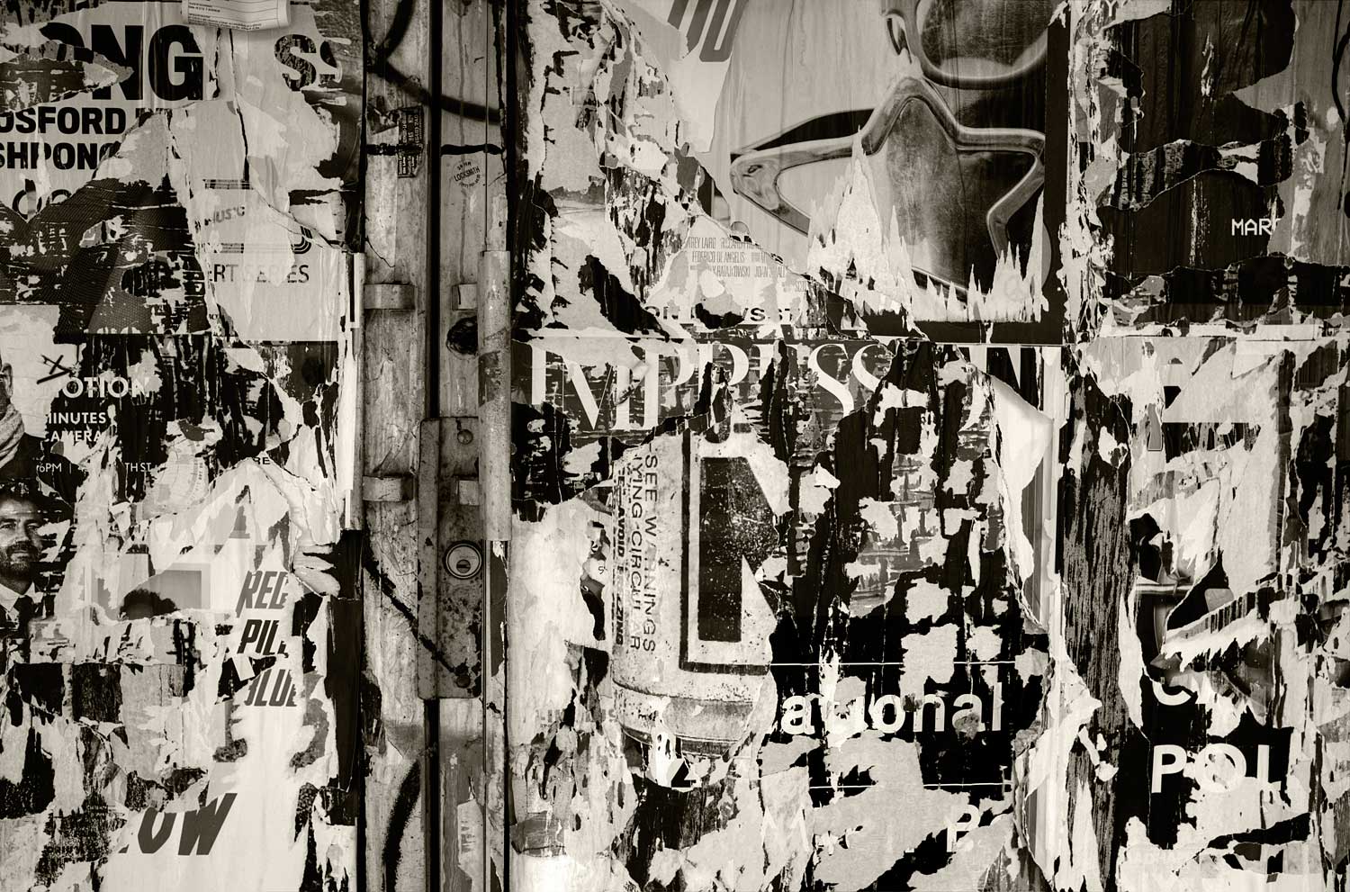 I really like unintentional art. In my mind this rivals Jackson Pollock. But thats just me. This one can pretty much be concluded to remain in color. Color is what this is all about. Just to make sure, lets take a look at it as monochrome. Kind of like a monochrome rainbow.
 One more. This is like the previous image. Again, unintentional art, and again a case where removing the color really puts a damper on things. But I always like to check just to make sure, and I do a bit of playing around when I check just converting to monochrome for a quick check doesnt cut it. Remember toward the end of Raiders of the Lost Ark when the Nazis open the ark and an image of a beautiful woman emerges, who then turns into a horrid skeleton? This is the result of adding a Photoshop Black and White layer and moving the red slider all the way to the left and the magenta slider all the way to the right. So now youve got a choice the lady or the tiger. It really comes down to what you want to say, and how you want your viewer to feel.
This segues us to what Minor White referred to as an equivalent. My favorite quote of his is to photograph something not for what it is, but for what else it is. Equivalence, I have found, works very well in music but is unfortunately little understood in photography.
In Minors words, "When any photograph functions for a given person as an Equivalent we can say that at that moment and for that person the photograph acts as a symbol or plays the role of a metaphor for something that is beyond the subject photographed." We are now talking about a photograph that is greater than the photograph itself. Alfred Stieglitz used the term Equivalents in a series of cloud photographs, and I would highly recommend looking into this.
Minor added a bit more about this "When the photographer shows us what he considers to be an Equivalent, he is showing us an expression of a feeling, but this feeling is not the feeling he had for the object that he photographed. What really happened is that he recognized an object or series of forms that, when photographed, would yield an image with specific suggestive powers that can direct the viewer into a specific and known feeling, state or place within himself."
Basically, this is the removal of the subject from the idea. Here I photographed a little girl, but this is not a picture of a little girl, it is a picture of hope, fear, wondering, confusion, and any number of other emotions that might be evoked through the process of looking at the image.
For me, the purpose of photography is to move someone from one place to another. If I can take them on my journey then that is the best of all worlds if I can send them on their own, then that works too.
But we are different people and almost certainly, without the explanation, will see other things in the image. But thats okay, if you understand that the image has less to do with the specific little girl and more to do with something else then you are realizing that my image is open to interpretation. Thats where art enters, and if you realize this then you realize that I have created art. It is much easier, at least for me, to create art through monochrome than color.
The designation of a successful image is not a binary option. If you create an image and feel that it has expressed your intentions then you can consider it to be successful. If the viewer correctly receives those intentions then for both it is successful. When talking about equivalents the exact intention is almost impossible to transfer, but if the viewers emotions are affected similarly then I would argue that that is as successful as one can get.
Interpretation is the key that unlocks everything. Color presupposes the completion of a vision, the lack of color demonstrates the fact that there is more to what the viewer is looking at than literally meets the eye, so it is then the viewers task to fill in the blanks.
As we are all different we will all fill in those blanks based on our own personal biases. It is the photographers duty to guide the viewer to the conclusions of the photographers biases, while making the viewer think that these conclusions are their own.
Remember I said, "Its easier and harder"?
The "harder" part is that now I know that I have got the power, the onus is on me to find the best way to use it. There is now an expectation that in creating art I am saying something, and perhaps a hope that you understand what I am saying. That is hard really hard. Basically, I have the tools, now the question is whether or not I can use those tools to our mutual benefit.
When working with equivalents the meaning may only be suggested by the subject, and it is my duty to work with the image to get you, as the viewer, to the point where you understand what that underlying emotion might be.
That is pretty much an impossible task, even if I can start by telling you that this image is not about my granddaughter standing at the bottom of the slide. If this were a color image then it is a picture of her on the slide so our work here is done. Ive got many, many pictures of my granddaughter that are intended to be snapshots, but this one I selected to make art. Did I succeed in at least getting you to think about the image? If so, then I have accomplished my task, and if I could succeed in using the power given to me to create art then you will have arrived at some conclusion as to what the image is about. It doesnt have to agree with my intentions, but Ill take it.